
Story of the Dis/Placements logo
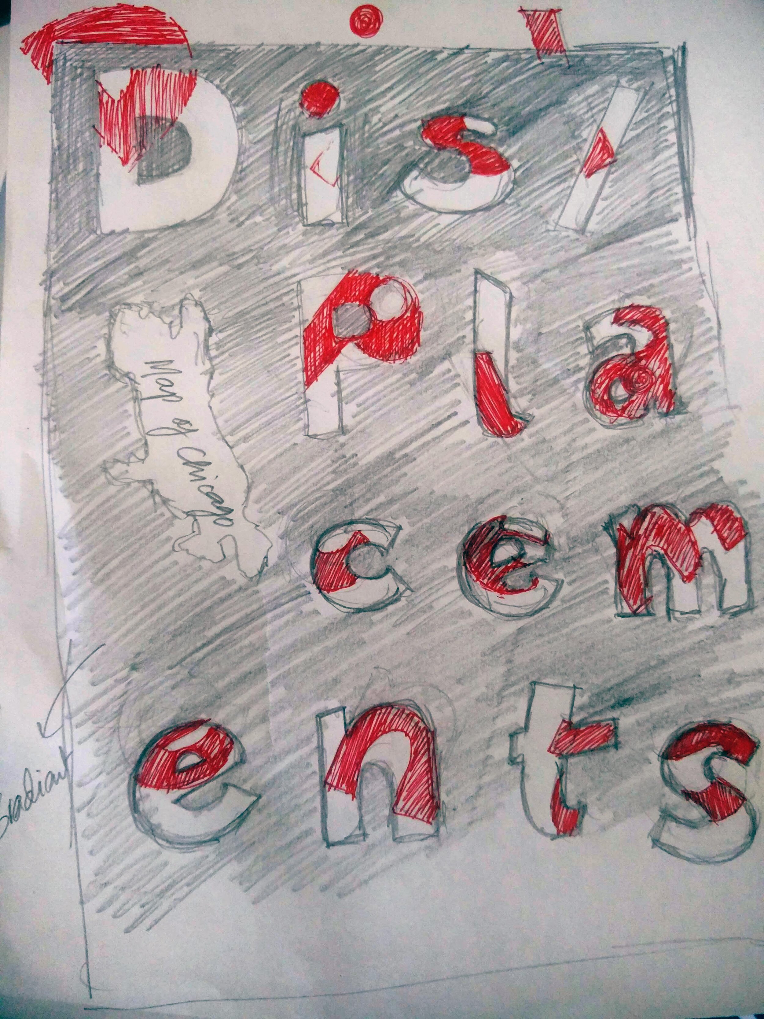
LOGO DESIGN STORY
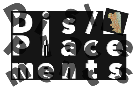
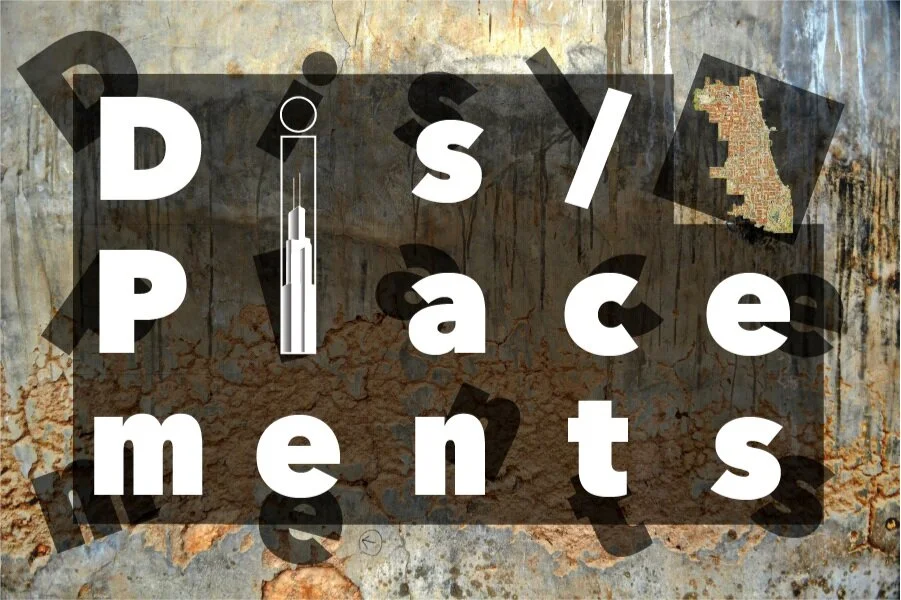
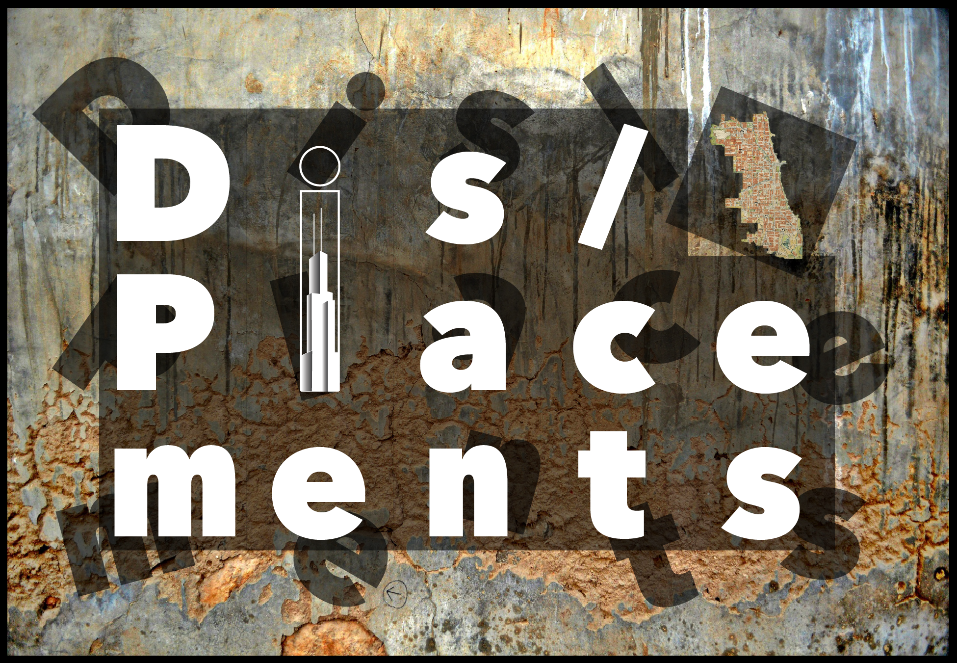
DIS/PLACEMENTS
By Nidhi Sharma, designer of the Dis/Placements Logo
The first time I was introduced to the word “displacement” was in a mathematics class in the year 2005. Drawing on this mathematical understanding, displacement is the shortest distance between an object’s initial and final positions in motion. In other words, it refers to a state of change in the object’s location, suggesting that the object has moved or is displaced. However, the simple definition of the word “displacement” becomes more complex in the socioeconomic context of human migrations – within and outside city, state, and national boundaries.
Within the historical folds of a place reside multiple forms of displacements. As a byproduct of real estate “development,” or misdirected urban renewal policies, affected by weak governance or due to conflicts over visions of growth, safety or environmental concerns, or reflecting the manifold, disturbing, and mysterious ways capitalism functions – this version of displacement is multifaceted.
The logo is designed by Anna Guevarra, Gayatri Reddy, and Nidhi Sharma.
For the design of the logo Dis/Placements – I borrowed some aspects of the idea of mathematical “displacement” and juxtaposed it with what both Prof. Gayatri and Prof. Anna highlight in this project, namely, “the deeper excavation of one neighborhood - Uptown - and its stories of resistance” to represent “the complexity of the history of peoples’ displacements and the ongoing struggles over land, housing, health care and education stemming from urban renewal policies.”
The final logo is a product of extended discussions, assimmilations, and visualizations of these tangled displacements, and “the active place-making that, over the course of the last century, produced Uptown as a multiracial anomaly in Chicago.”
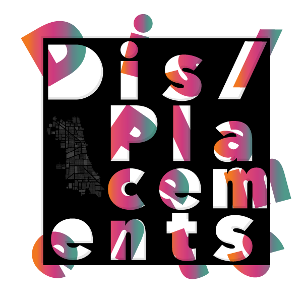
The key stories that the design of the logo represents are the following –
+ Background Photo
A background capturing a section of the damaged plaster on a wall – a state reflecting the texture & histories of displaced peoples and communities.
Credit - Rajesh Misra
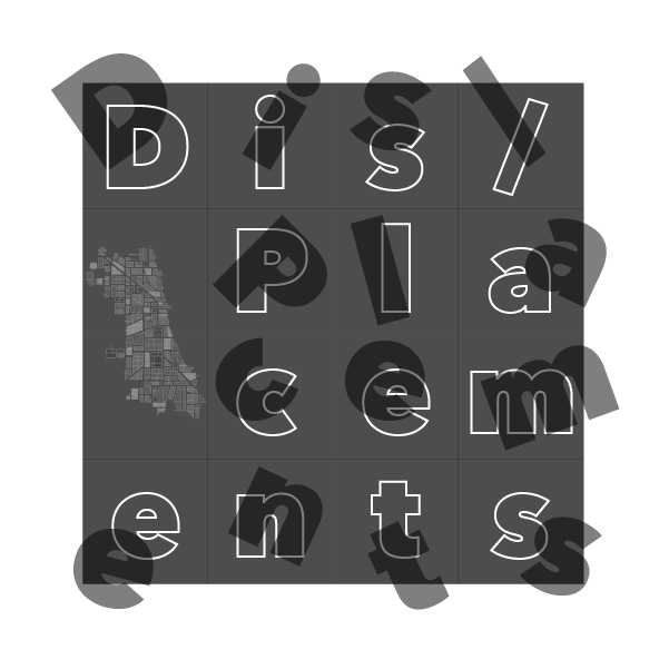
+ The Grid
Laying each letter in the word "displacements" in a 3 by 5 grid, a grid that also represents the essence of most American urbanized centers.
+ Map of Chicago
Disrupting the uniformity of the grid is the displaced tile that highlights the metropolitan map of Chicago. The effect is to bring attention to displacement and place-making and how these are crucial in defining or reinforcing the idea of "diversity" and "development" in a city like Chicago.
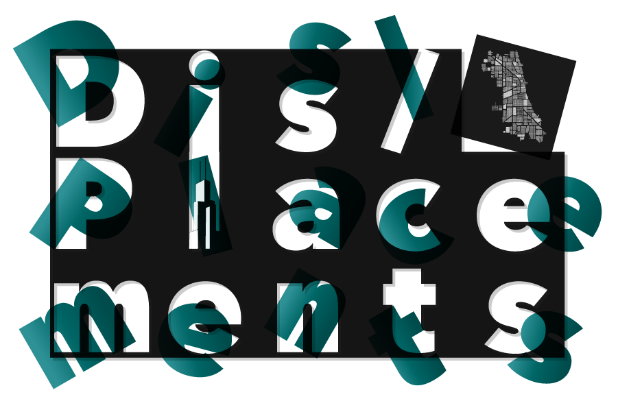
+ Willis Tower
By aligning the letters in a 3 by 5 grid, one condition emerged during the design process. This condition resulted in the combination of the alphabet "i" and "l" to frame the tallest skyscraper in the city – the Sears/Willis tower – which also happens to be an architectural marvel and as Kevin Lynch notes in his 1960’s book The Image of the City – a "landmark."
+ The Displaced Shadow
The most crucial design element is the doubling of the letters, giving an appearance of dissonance. Each letter’s shadow floats in a different plane from the source letter that is neatly stacked within the invisible grid. This juxtaposition is necessary to frame the mathematical "displacement" that symbolically represents the multifarious ways in which urban displacement exists and is felt by the residents of the city.